Brand Concept
Stag & Thistle embodies refined property management with a touch of heritage and prestige. The name and visual identity evoke strength, tradition, and reliability, positioning the brand as a premium choice in the property sector. With a focus on professionalism and excellence, Stag & Thistle blends modern service with classic values, ensuring clients feel secure and well-served.
Logo Breakdown
Symbolism – Stag Antlers & Thistle
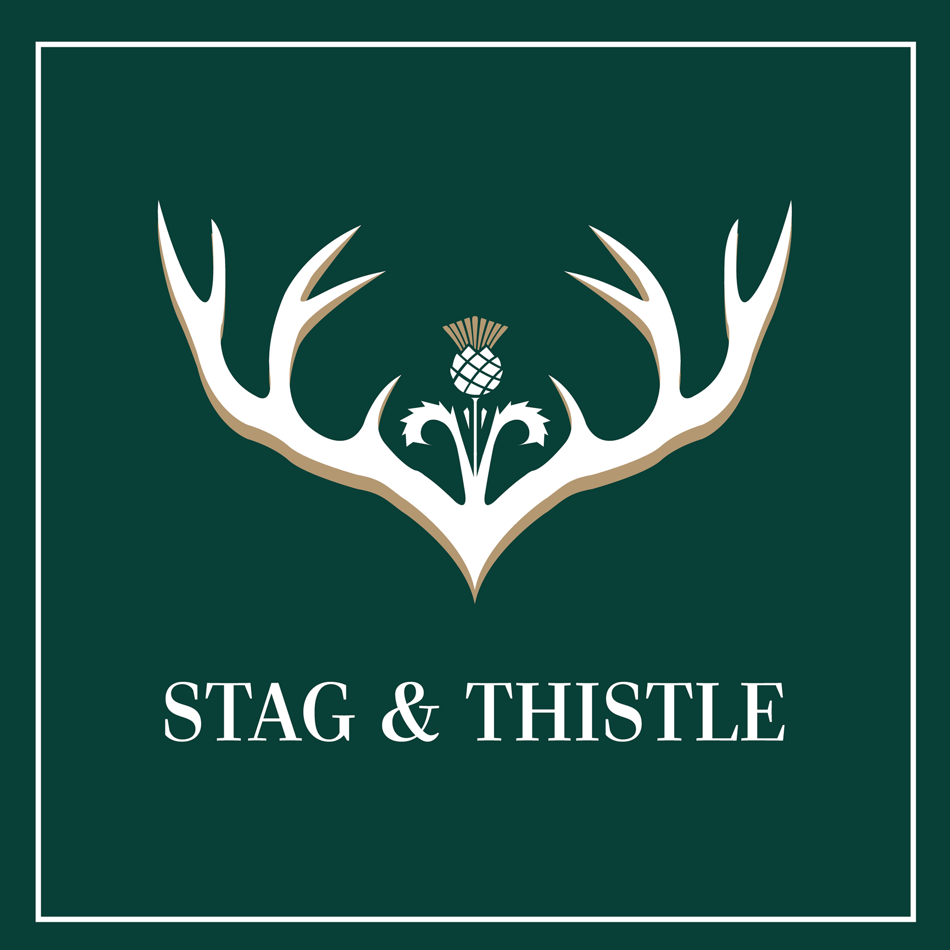
The stag antlers represent strength, leadership, and protection, reinforcing the idea of a property firm that stands tall, providing stability and trust. The thistle, Scotland’s national flower, symbolizes heritage, resilience, and prestige, adding a sense of exclusivity and tradition to the brand. The combination subtly communicates a premium, well-established presence in property management.
The stag antlers represent strength, leadership, and protection, reinforcing the idea of a property firm that stands tall, providing stability and trust. The thistle, Scotland’s national flower, symbolizes heritage, resilience, and prestige, adding a sense of exclusivity and tradition to the brand. The combination subtly communicates a premium, well-established presence in property management.
Typography – Elegant & Timeless
The choice of classic serif typography reflects sophistication, reliability, and professionalism. The balance between bold and refined lettering ensures the brand feels both high-end and approachable, catering to discerning property owners and tenants alike.
The choice of classic serif typography reflects sophistication, reliability, and professionalism. The balance between bold and refined lettering ensures the brand feels both high-end and approachable, catering to discerning property owners and tenants alike.
Color Palette – Deep Green & Gold
Deep Green symbolizes growth, stability, and wealth, reinforcing trustworthiness and a connection to heritage.
Gold Accents add luxury, prestige, and refinement, creating an upscale feel that elevates the brand above standard property firms.
Overall Aesthetic – Minimal & Premium
The logo and branding maintain a clean, sophisticated aesthetic, avoiding unnecessary clutter while maintaining visual impact. The strategic use of space and symmetry ensures the brand looks polished, high-end, and memorable across all touchpoints, from business cards to property signage.
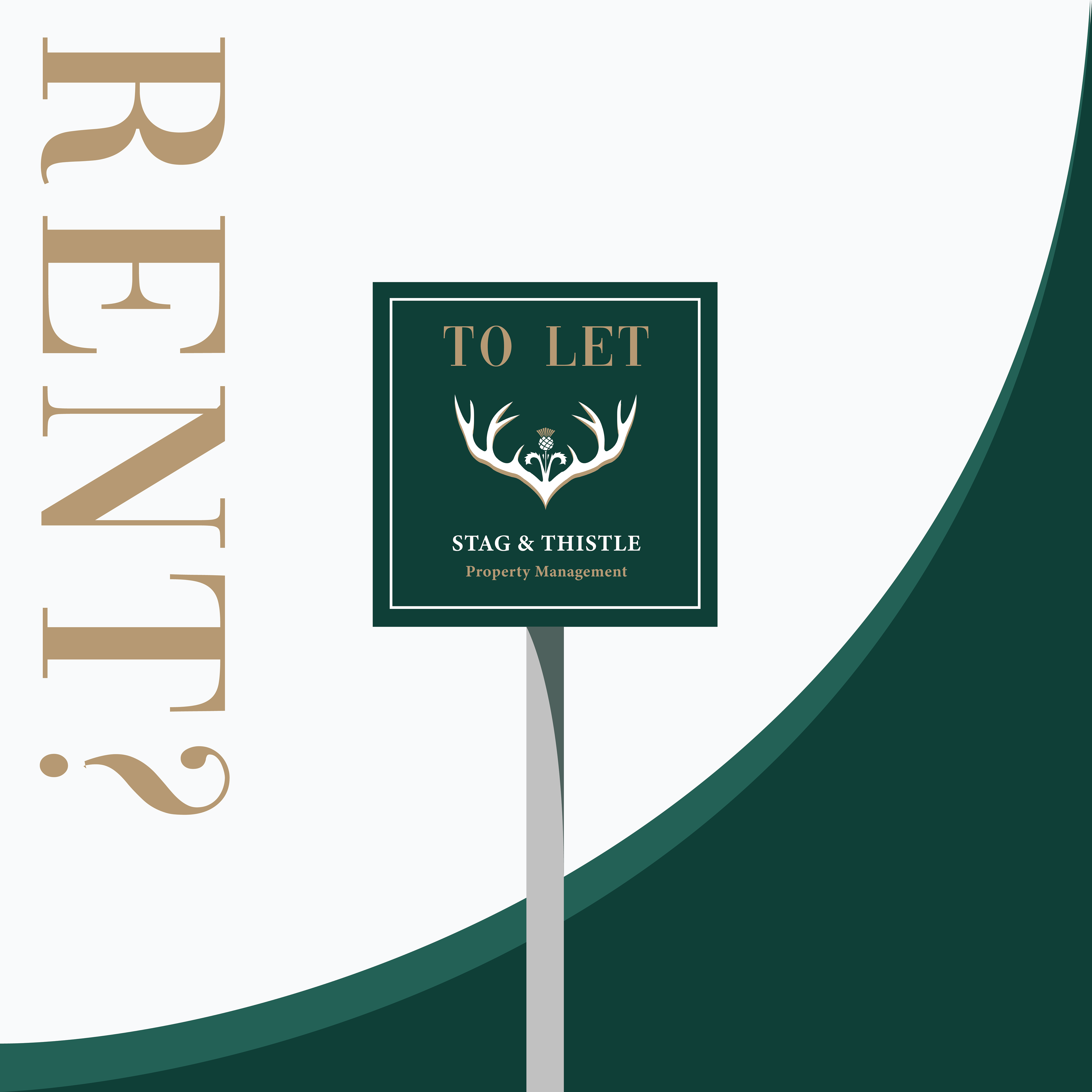
The logo and branding maintain a clean, sophisticated aesthetic, avoiding unnecessary clutter while maintaining visual impact. The strategic use of space and symmetry ensures the brand looks polished, high-end, and memorable across all touchpoints, from business cards to property signage.
