Branding | Print Design | Digital Design | Web Development
Reimagining Highams Saaz LLP’s brand to resonate with its target audience in the finance and investment industry. Crafting materials for both internal and external stakeholders, the goal is to present a distinctive and memorable image that sets them apart.
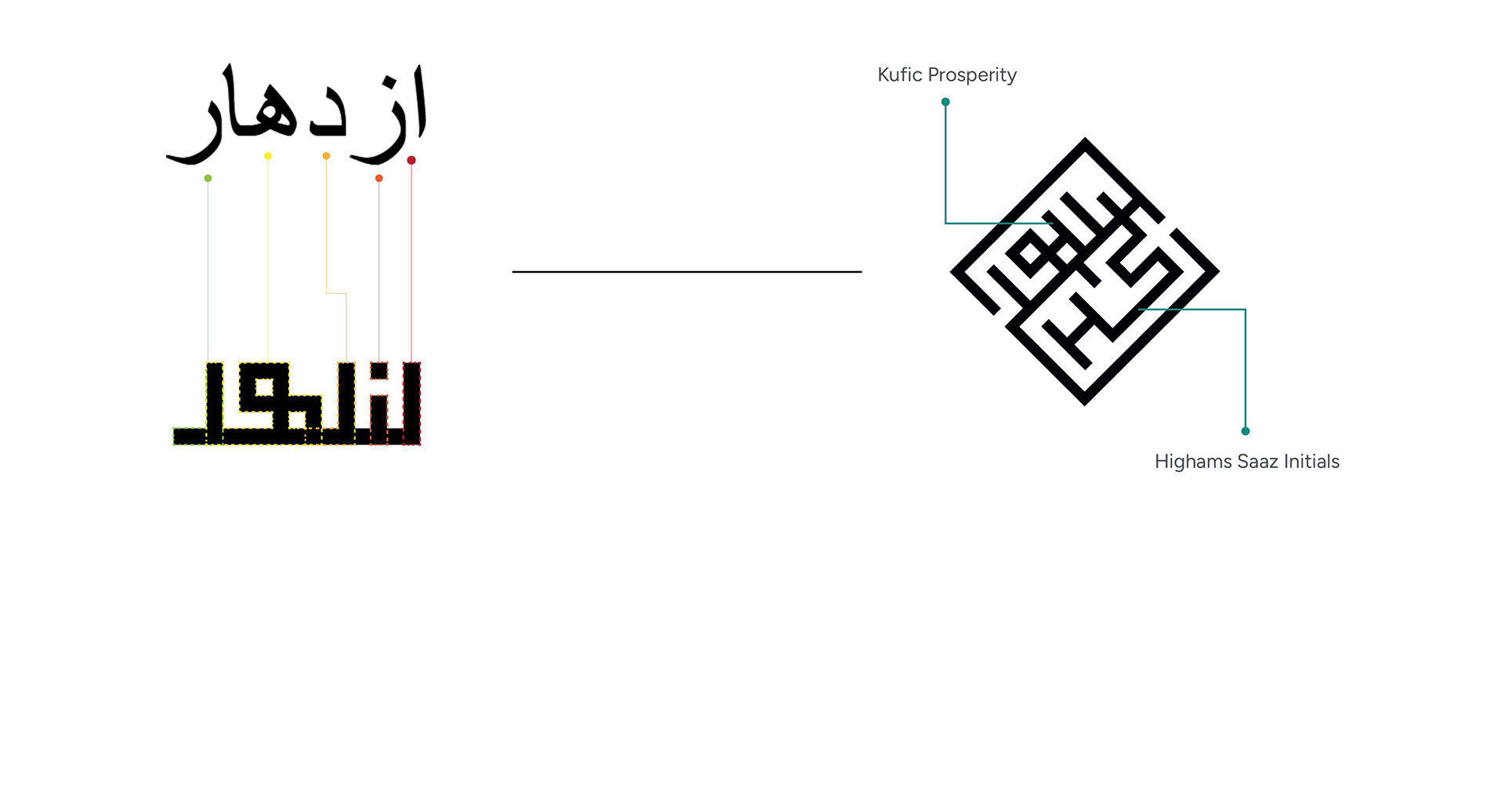
Embodying the Kufic design principles, its approach is rooted in intricate details, leveraging mathematical precision to craft a logo that is not only sophisticated but also unique within its industry. This mirrors the commitment of Highams Saaz LLP to delve into the finite details with clients, from initial consultancy to rigorous due diligence. Renowned for our capacity to explore the finer aspects of a business, Highams Saaz LLP stands out for its meticulous attention to detail and hybrid business model.
Website design in-line with the brand identity. The logo icon and prominent diamond is consistent throughout the brand and documentation.

Documentation design
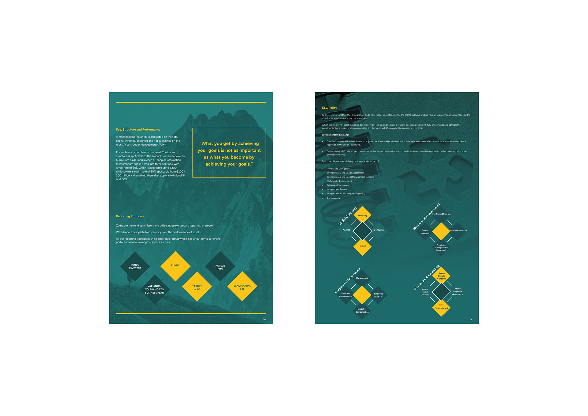
Documents designed to carry forward the brand identity. Using the icon and diamond structure throughout the document within multiple aspects has created a strong unique identity that is consistent on all mediums.

Rebrand 2
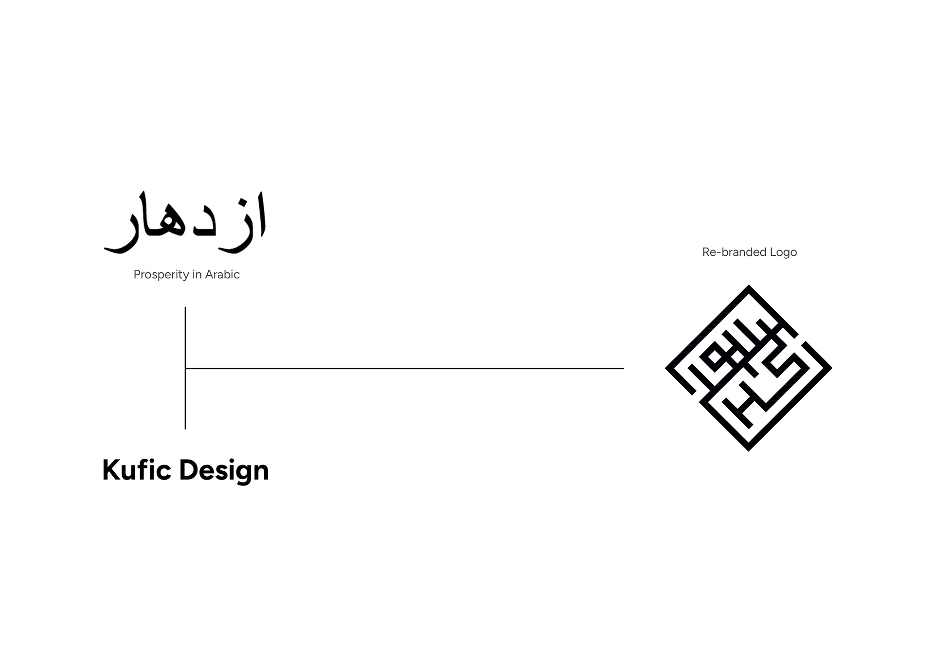
The second rebrand logo’s directive is to preserve the essence of Kufic inspiration while allowing the logo to evolve, ensuring continuity with its established identity. The evolution of the brand was necessary as the company brand would be used on a wider range of mediums and the first rebrand did not suit small scaled digital and print platforms.

The diamond shape in the Highams Saaz logo symbolizes strength and integrity, reflecting the character of Highams Saaz. The term “prosperity” was chosen because it means success or thriving, giving a
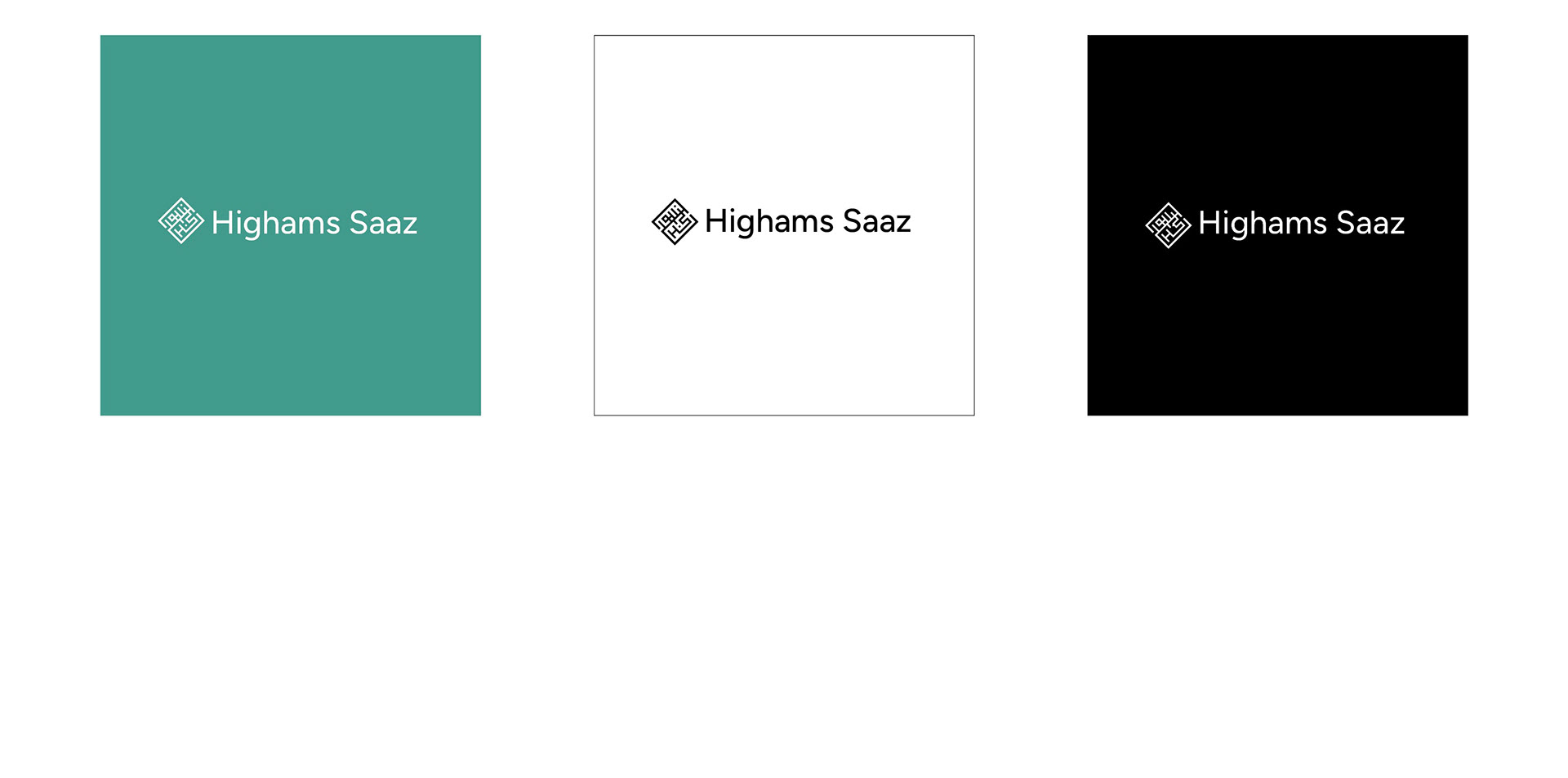
Variations
Presentations Design
Documentation design aimed at financial institutions. The overall brand now has a minimal aesthetic which is easy to understand but still has unique elements to it.