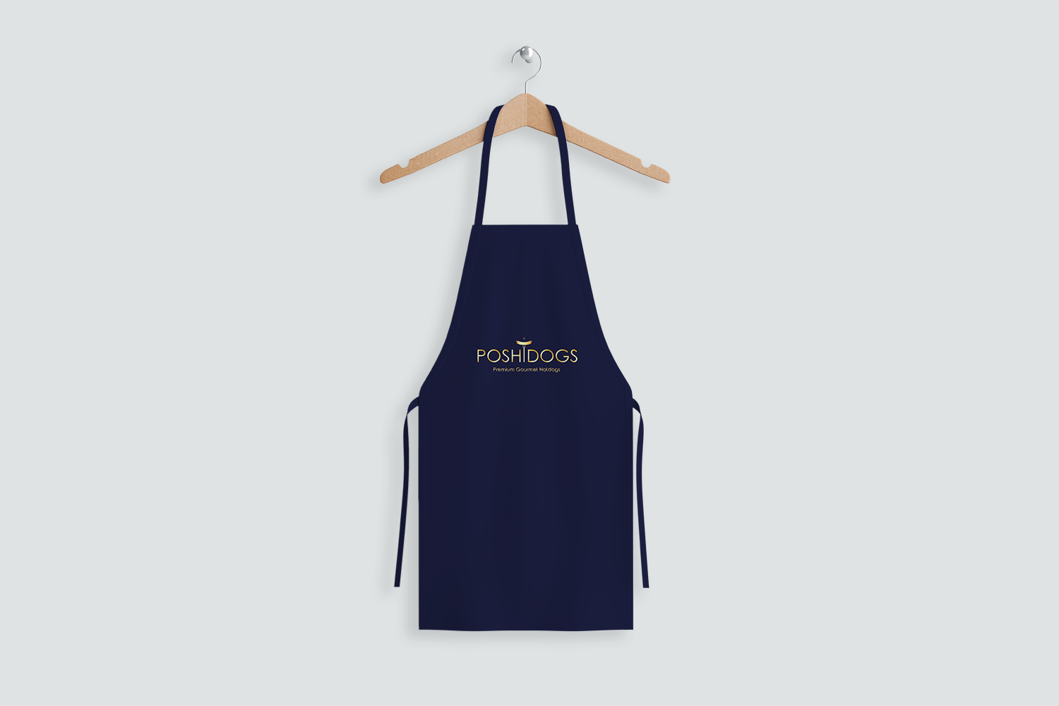
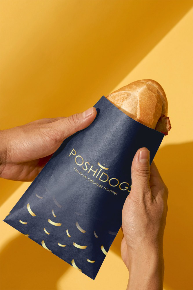
Brand Concept
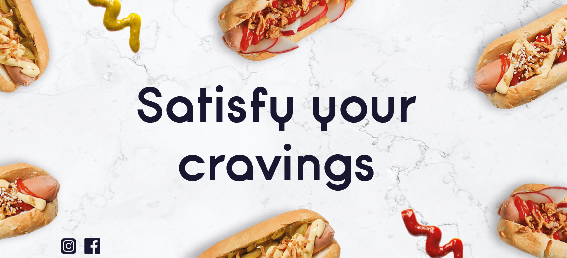
Posh Dogs redefines the classic hot dog with a premium, upscale twist. This brand isn’t about ordinary street food—it’s about elevating a beloved favorite with gourmet ingredients, refined presentation, and a luxury dining experience. Posh Dogs caters to food lovers who appreciate both quality and style, merging indulgence with sophistication.
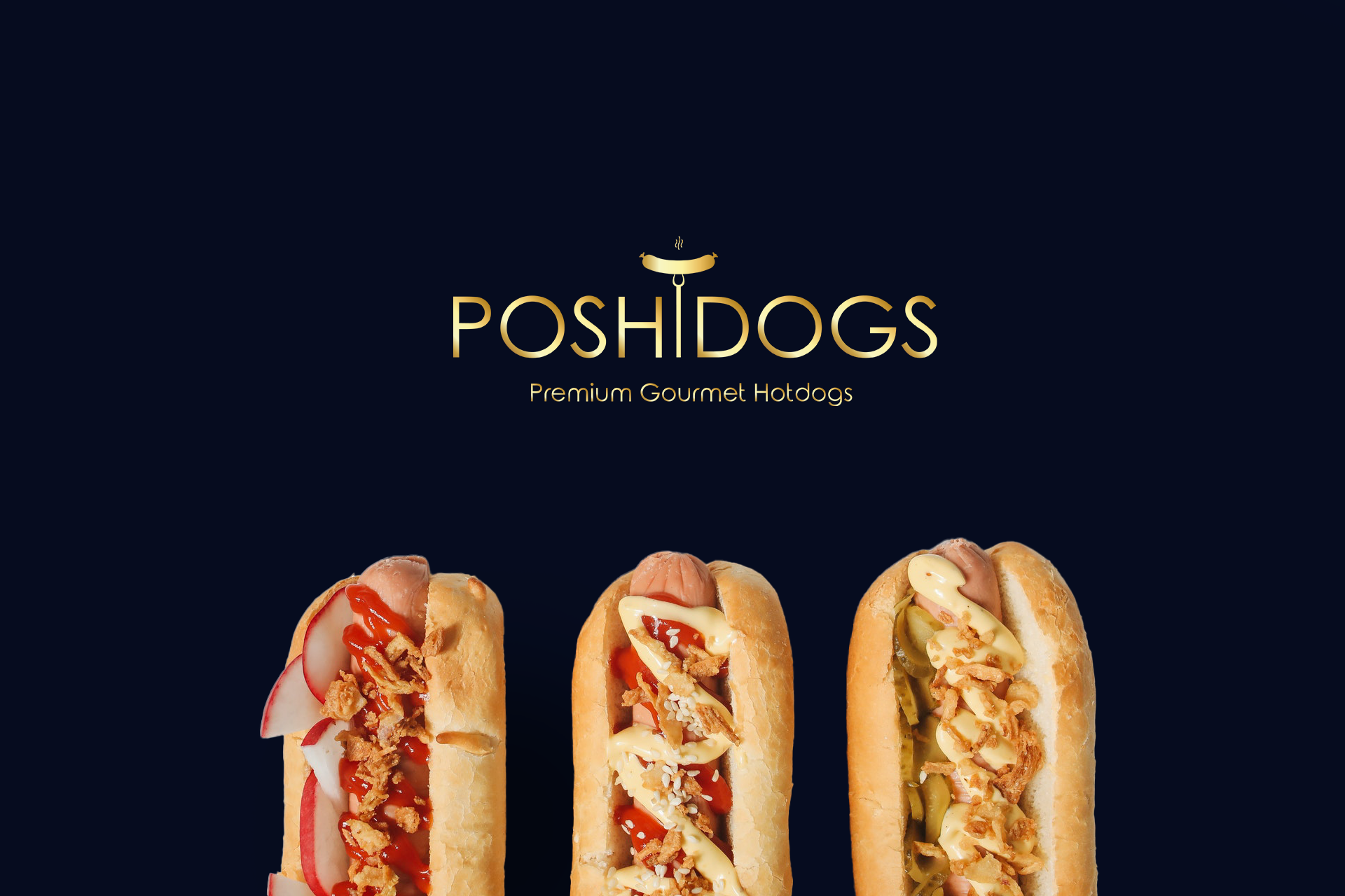
Logo Breakdown
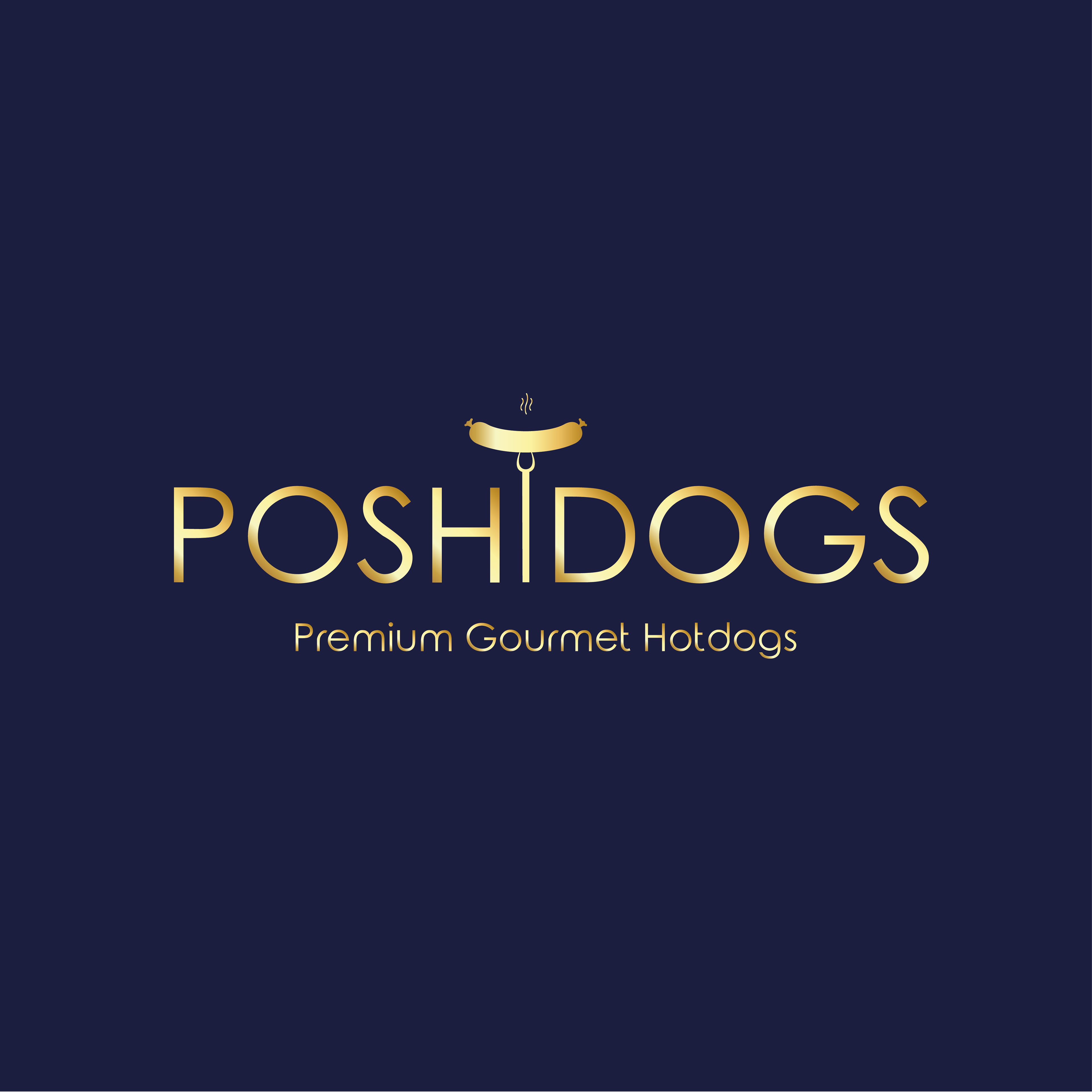
Symbolism – The Traditional Prong Fork
At the heart of the logo is a traditional prong fork, a clever nod to both culinary craftsmanship and the refined dining experience Posh Dogs delivers. The fork represents precision, quality, and gourmet preparation, reinforcing the idea that this isn’t just fast food—it’s a premium culinary experience.
At the heart of the logo is a traditional prong fork, a clever nod to both culinary craftsmanship and the refined dining experience Posh Dogs delivers. The fork represents precision, quality, and gourmet preparation, reinforcing the idea that this isn’t just fast food—it’s a premium culinary experience.
Typography – Minimalist Luxury
The golden minimalist font conveys elegance and exclusivity, much like high-end restaurants or premium food brands. The simplicity of the typeface avoids clutter, ensuring a sleek, high-class aesthetic while remaining highly readable.
The golden minimalist font conveys elegance and exclusivity, much like high-end restaurants or premium food brands. The simplicity of the typeface avoids clutter, ensuring a sleek, high-class aesthetic while remaining highly readable.
Color Palette – Bold & Luxurious
The chosen bold, rich colors (likely gold, black, deep reds, or navy) exude luxury and sophistication. Gold, in particular, is often associated with prestige and high value, reinforcing the premium nature of the brand. The contrast between these strong hues helps the brand stand out in a competitive food market.
The chosen bold, rich colors (likely gold, black, deep reds, or navy) exude luxury and sophistication. Gold, in particular, is often associated with prestige and high value, reinforcing the premium nature of the brand. The contrast between these strong hues helps the brand stand out in a competitive food market.
Overall Aesthetic – Minimal & Premium
By keeping the design clean, refined, and sophisticated, the logo avoids unnecessary embellishments, ensuring a modern, high-end appeal. The balance between boldness and minimalism positions Posh Dogs as a premium choice, setting it apart from everyday hot dog vendors.
By keeping the design clean, refined, and sophisticated, the logo avoids unnecessary embellishments, ensuring a modern, high-end appeal. The balance between boldness and minimalism positions Posh Dogs as a premium choice, setting it apart from everyday hot dog vendors.